• Gemini Video Generation?!

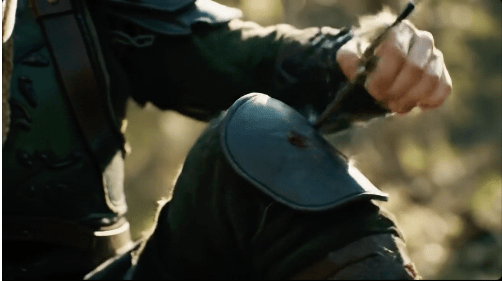
    You know I had to do an “Arrow in the Knee” video. 🙂

    This isn’t even the new Gen3 model. And, it’s pretty good. But it isn’t a “movie” it’s an 8sec clip. There’s no audio. So, while you get the idea of what’s going on, it’s essentially a fancy animated gif, right?

    Man that looks like it hurts!

    It’s fun to play with generative tools and create novel audio, images and videos. But there is also a practical business use for these tools. Like with the next clip I generated. Those business use cases are what is driving rapid advancement and funding for AI.

    Say I was writing an article about hardshell tacos. Even without words or sound, looping this video could add more interest to the article versus a still photo. The difference being it actually illustrates assembling the taco vs implying it.


    Yes AI is; and will continue to replace demand for skilled creators. But it will also create new opportunities. And, for those that can blend the skill of AI prompting with their real world skills, there is likely a bright future. Those that don’t adapt will eventually be the ones creating novel nostalgic content. Like people who use film cameras today.

    There is nothing wrong with that. For most creatives it’s a hobby, not a job. You don’t have to pick a team. You can just enjoy creating.

  • River of Time

    Because it was so much fun last time.

    “River of Time” generated by Suno. As you might guess the featured image is AI too.

    [Verse]
    The water flows it knows no rest
    It carves the mountains does its best
    Through valleys deep where shadows play
    The river moves it won’t delay

    [Chorus]
    You never stop in the same river twice
    The current whispers a roll of dice
    Each moment gone like grains of sand
    The river’s law we understand

    [Verse 2]
    The stones it kisses smooth with care
    It dances wild through open air
    A mirror bending truth and lies
    Reflecting hearts and endless skies

    [Bridge]
    The echoes call from ancient streams
    Where time is woven into dreams
    No map can chart this fleeting course
    The river runs with timeless force

    [Chorus]
    You never stop in the same river twice
    The current whispers a roll of dice
    Each moment gone like grains of sand
    The river’s law we understand

    [Verse 3]
    Its voice is bold its soul untamed
    Yet still it changes though unnamed
    It carries life it bears our cries
    The river flows it never dies

  • Magic of Gradients

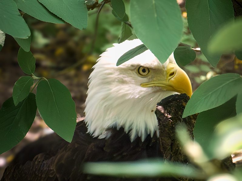
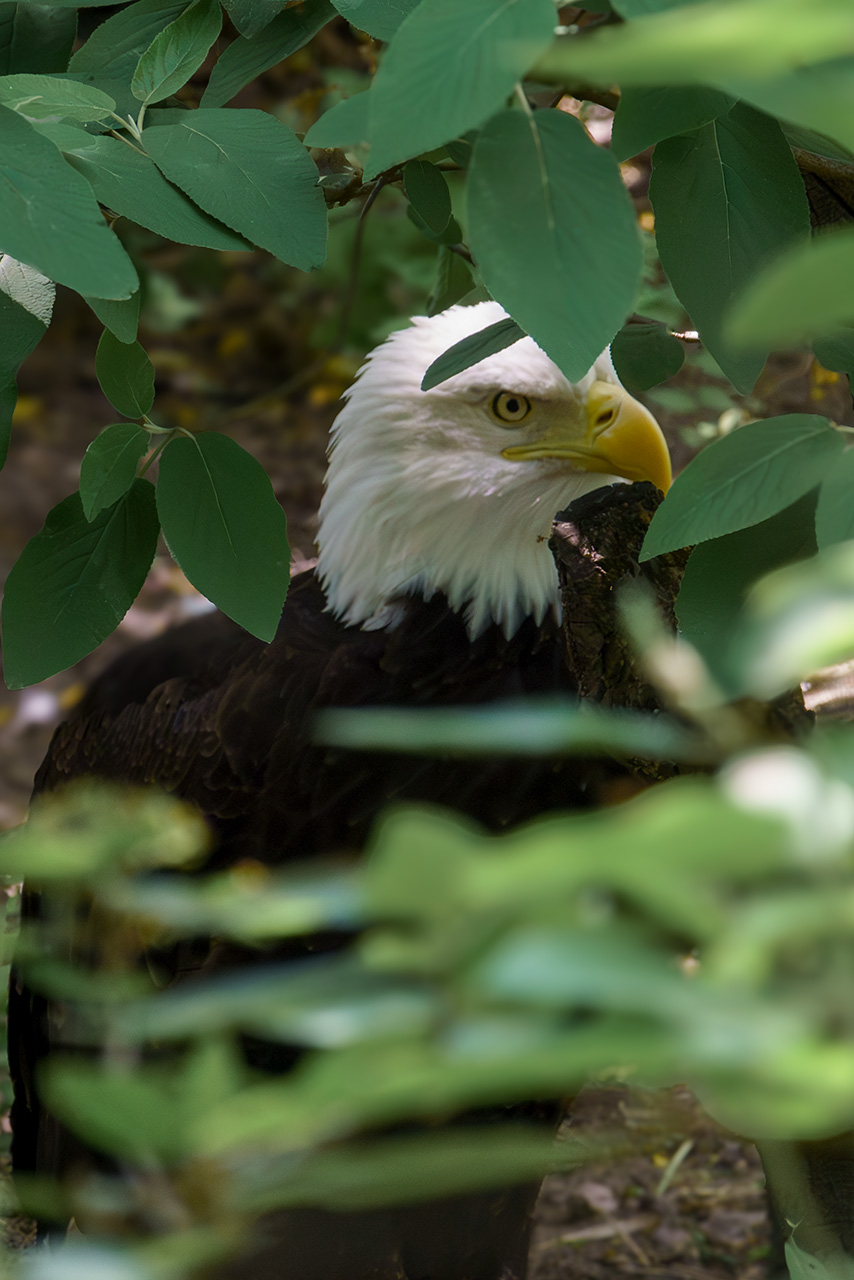
    Gradients are the secret sauce of digital light to me. I know, digital light seems like an odd choice of words. But I don’t know what better words to use. Because that is how I often use them. I use them to recolor things. Enhance color. Suppress color. Or, add and take away light. All of which I did here. Have a look at this side-by-side. to see what I mean.

    Before I go any further, this image was never a “keeper” for many reasons. Not the least of which was the missed focus. This is also not a complete edit. It’s a scratch pad experiment.

    A lighting experiment. Which brings me to ’round to gradients. My goals were:

    • Pull the eagle up from the shadows
    • Relight the image to create more direct light on the leaves
      • Draw the viewer to the center of the image faster
      • Further suppress the outer-edges to make the eagle stand out more
    • Try not to lose all the feather detail in the process

    Tools and Steps

    Once I got out of Camera Raw I started by using a a blue and ivory radial gradient to brighten the eagles face and cool the leaves in the foreground. Then I applied a solid color (#d18c47) layer add some warmth to where the sunlight naturally fell on the eagle’s head and on the visible ground.

    Lastly, I made a stamped layer and opened it in Camera Raw as a filter. Within Camera Raw I used vertical gradient masks to adjust exposure and contrast to create the beam of light effect.

    Final thoughts

    Not bad for a 4 layer edit. I think I achieved the goals.

    In hind-sight, I probably could have created the beam effect in Photoshop. It might have been a little bit easier in Camera Raw. But using Camera Raw as a filter is destructive. Whereas if I had used adjustment layers in Photoshop. The whole edit would have been non-destructive. Which is ideal.

  • Arrows in the Knee

    I enjoy exploring all kinds of tech. For the fun of it I present…

    “Arrows in the Knee” generated by Suno. As you might guess the featured image is AI too.

    [Verse]

    In shadows deep where arrows sing
    A warrior with his elven ring
    Against the orcs he stood alone
    A legend in the battle zone

    [Verse 2]

    His bowstring twanged his spirit soared
    But fate had sharpened its own sword
    An arrow flew with deadly glee
    And found its mark below his knee

    [Chorus]

    Arrows in the knee do tell
    Of heroes brave who stood so well
    With bleeding knee he faced the end
    A tale for ages to transcend

    [Verse 3]

    He fell but never lost his pride
    With every heartbeat he’d collide
    Though outnumbered and in pain
    His honor in the mud sustained

    [Bridge]

    Orcs approached with snarling cries
    But in his heart his courage flies
    An elven spark that cannot die
    Burned in the starlight cold and high

    [Chorus]

    Arrows in the knee do tell
    Of heroes brave who stood so well
    With bleeding knee he faced the end
    A tale for ages to transcendEdit

  • Photoshop Blend Modes

    Unlock Your Creative Potential

    Adobe Photoshop is a powerhouse for image editing and graphic design, and nestled within its many features is a tool that can truly transform your work: Blend Modes. If you’ve ever wondered how designers achieve those seamless image combinations, ethereal lighting effects, or gritty textural overlays, the answer often lies in the clever use of these modes. This guide will demystify Photoshop Blend Modes, helping you understand what they are, how they work, and how you can start using them to elevate your own creations.

    What Exactly Are Blend Modes?

    At their core, blend modes are mathematical equations that dictate how the pixels on one layer interact with the pixels on the layer(s) directly beneath it. Think of it as a set of instructions that tells Photoshop how to combine the colors and tones of your selected layer (the “blend” layer) with the underlying layer (the “base” layer). The result is a combined image that can look dramatically different from the individual layers.

    To use blend modes, you’ll typically need at least two layers in your Photoshop document. The blend mode option is a dropdown menu located at the top of the Layers panel, usually set to “Normal” by default. Clicking on this dropdown reveals a list of different modes, each offering a unique way to blend your layers.

    Navigating the Categories of Blend Modes

    Photoshop organizes its numerous blend modes into several logical groups, which can help you anticipate the kind of effect a mode will produce:

    • Normal Group: This group contains “Normal” (the default, where the top layer simply covers the bottom layer, opacity permitting) and “Dissolve” (which creates a speckled, random pixel effect based on opacity).
    • Darken Group: As the name suggests, these modes generally result in a darker image. They compare the pixels of the blend and base layers and keep the darker of the two. White pixels on the blend layer become invisible. Popular modes here include:
      • Multiply: One of the most widely used modes. It multiplies the color information of the blend and base layers, resulting in a significantly darker image. Excellent for deepening shadows or applying textures where the white areas of the texture disappear.
      • Color Burn: Creates a more intense, saturated darkening effect than Multiply, often increasing contrast.
      • Linear Burn: Similar to Multiply but generally produces even darker results.
    • Lighten Group: Conversely, these modes produce a lighter overall image. Black pixels on the blend layer become invisible. Key modes include:
      • Screen: The opposite of Multiply. It’s fantastic for lightening images, creating glow effects, or compositing elements like fire or lens flares where the black background of the element should vanish.
      • Color Dodge: Creates a brighter, more contrasted lightening effect, often resulting in vibrant, sometimes blown-out highlights.
      • Linear Dodge (Add): Similar to Screen but generally produces even brighter results.
    • Contrast Group: These modes work by increasing contrast, simultaneously darkening darker areas and lightening lighter areas. 50% gray on the blend layer becomes invisible.
      • Overlay: A very popular choice. It combines aspects of Multiply and Screen. It tends to preserve highlights and shadows from the base layer while increasing mid-tone contrast.
      • Soft Light: A more subtle version of Overlay, producing a softer, more diffused lighting effect. Great for gentle color toning or adding subtle texture.
      • Hard Light: A more intense version of Overlay, producing harsher, more defined lighting and shadows.
    • Comparative (or Inversion) Group: These modes create effects based on the differences between the blend and base layers.
      • Difference: Subtracts the brighter pixels from the darker pixels. Blending with black causes no change; blending with white inverts the base layer colors.
      • Exclusion: Similar to Difference but with lower contrast.
    • Component (or Color) Group: These modes utilize different color components (hue, saturation, luminosity) from the blend and base layers.
      • Hue: Applies the hue of the blend layer to the saturation and luminosity of the base layer.
      • Saturation: Applies the saturation of the blend layer to the hue and luminosity of the base layer.
      • Color: Applies the hue and saturation of the blend layer to the luminosity of the base layer. Perfect for colorizing grayscale images or changing the color of objects non-destructively.
      • Luminosity: Applies the luminosity (brightness) of the blend layer to the hue and saturation of the base layer. Useful for adjusting brightness without affecting colors.

    Getting Started with Blend Modes

    The best way to understand blend modes is to experiment! Try adding a texture layer over a photo, or a solid color adjustment layer, and then cycle through the different blend modes to see their impact. Don’t forget to also play with the layer’s opacity and fill, as these settings work in conjunction with blend modes to fine-tune the effect.

    Mastering blend modes won’t happen overnight, but by understanding their basic categories and the effects of some key modes like Multiply, Screen, Overlay, and Color, you’ll unlock a vast new range of creative possibilities in Photoshop. So go ahead, start blending, and watch your images transform!

  • A Truth About Real Friends

    Real friends don’t care about what you bring to the table other than yourself.

  • Official Blend Modes Help

    The more I learn, the more I feel like I forget. Here’s the link to the official Adobe Blend mode help article.

    https://helpx.adobe.com/photoshop/using/blending-modes.html

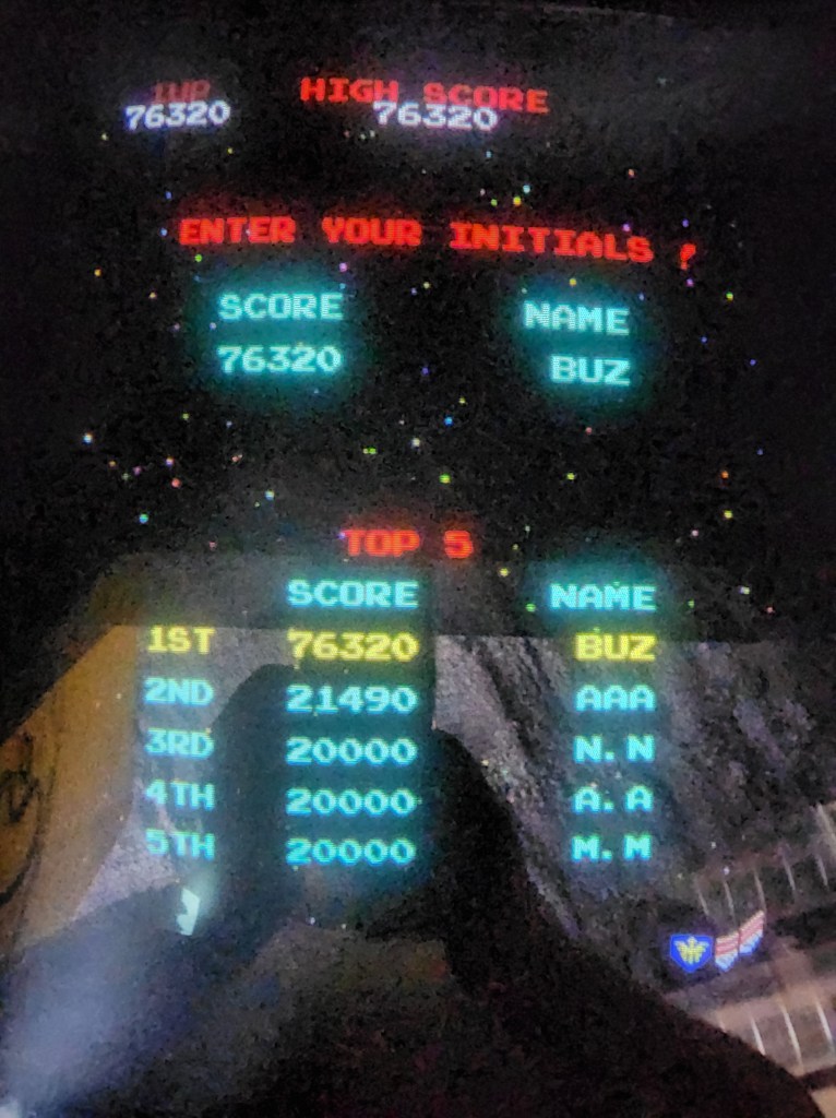
  • Probably the only time this will ever happen
    My first thought was to use ASS. 😛

    Snapped this during a day trip to Arcadia and Pinball Paradise in McLean, IL. The arcade had just opened for the day. So, I assume the machine was reset recently.

    Cheap win? You bet! Don’t judge me. LOL. I spent a LOT of quarters on Galaga in my teens and never made the Top Five.

    Check out the website. https://www.vintagevideogames.com

  • Infrared Creative Experiment

    I thought this turned out pretty cool. The statue image was taken with a 665nm Infrared Converted camera.

    The background is a combination of textures and gradients with gradient map overlay. To this day I have no idea what is in the statue’s hand. Or why he looks like he stabbing himself in the thigh.

  • White balance matters
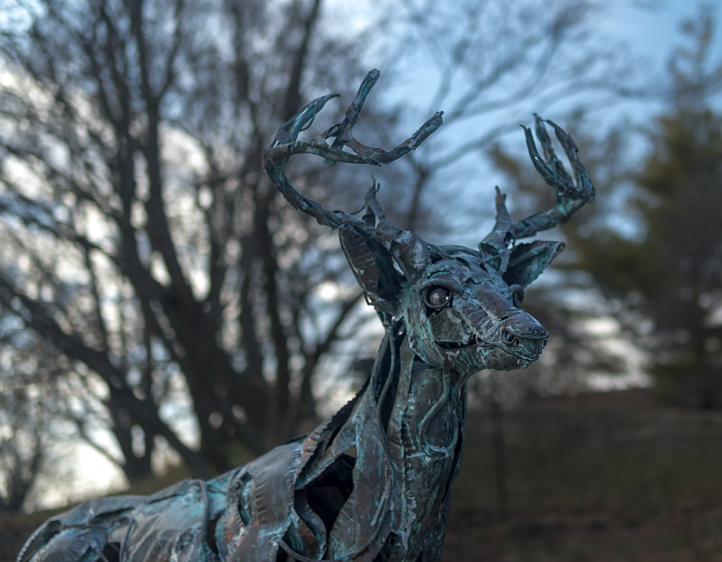
    Something is wrong with this picture. Actually several things.

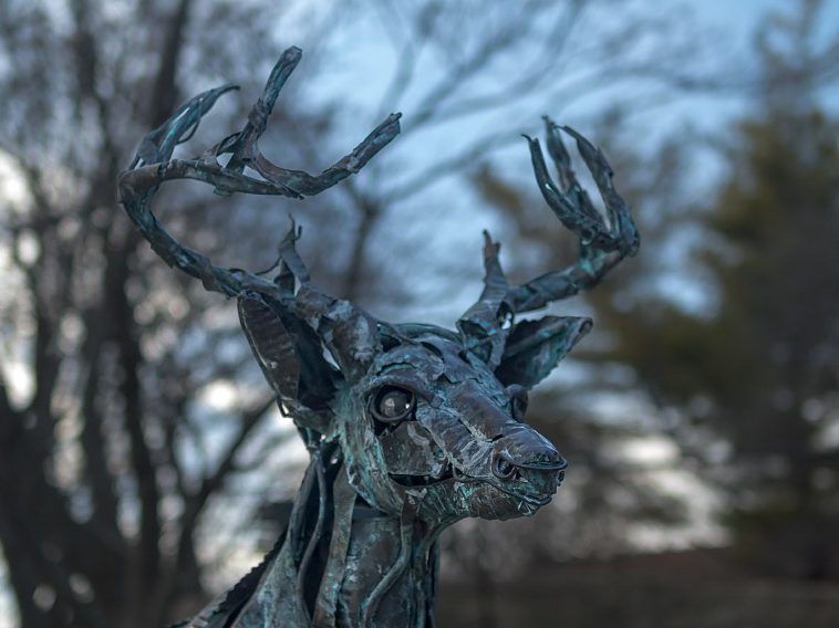
    Well, this was a novel issue. As photographers we normally struggle with tonal balance, this time the challenge was color fidelity. The deer statue’s correct hue is a specific blue-green, predominantly green, reminiscent of copper patina.

    Take-away? Pay attention to white balance.